
We will now move on to displaying our analysis results. In doing so, we will showcase a few variations that you will commonly use when presenting your results. These are a combination of graphs, text, shapes etc. So we are not going to discuss each one in detail, but only briefly. Let's get started right away.
Variation 1: The Single Graph + Text Double Column
In this variation we create a standard slide with one graph and additional text which is a common way of explaining key data in one single slide. We could for example discuss total market value which we then complement with additional text right next to it. The way we create this slide is easy. We put the graph on the left side of the slide and the text on the right side which gives us a double column.
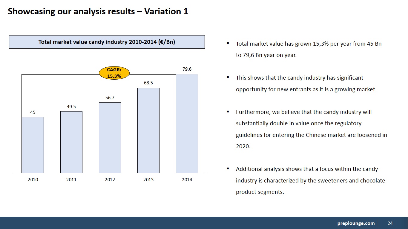
We can see in the example that we have two columns: A left side and a right side column. On the left side we place the graph along with all editing features. We have also added in the CAGR (compounded annual growth rate) in this graph to show y-o-y growth which is something we do often when we display growth graphs. Now you can place any type of graph here. Then on the right side we add additional text to complement our graph. If you do not have enough text to fill up the space use the space lining tool.
Variation 2: Double Graph + Double Text
In this variation we will again split the slide into two columns and place a graph plus text on each side of the slide giving us two graphs and two chunks of text. We use this format variation when we have two graphs that complement each other like the market value graph above coupled with a market segmentation. Then below each graph we add in the additional text. Let's take a look.
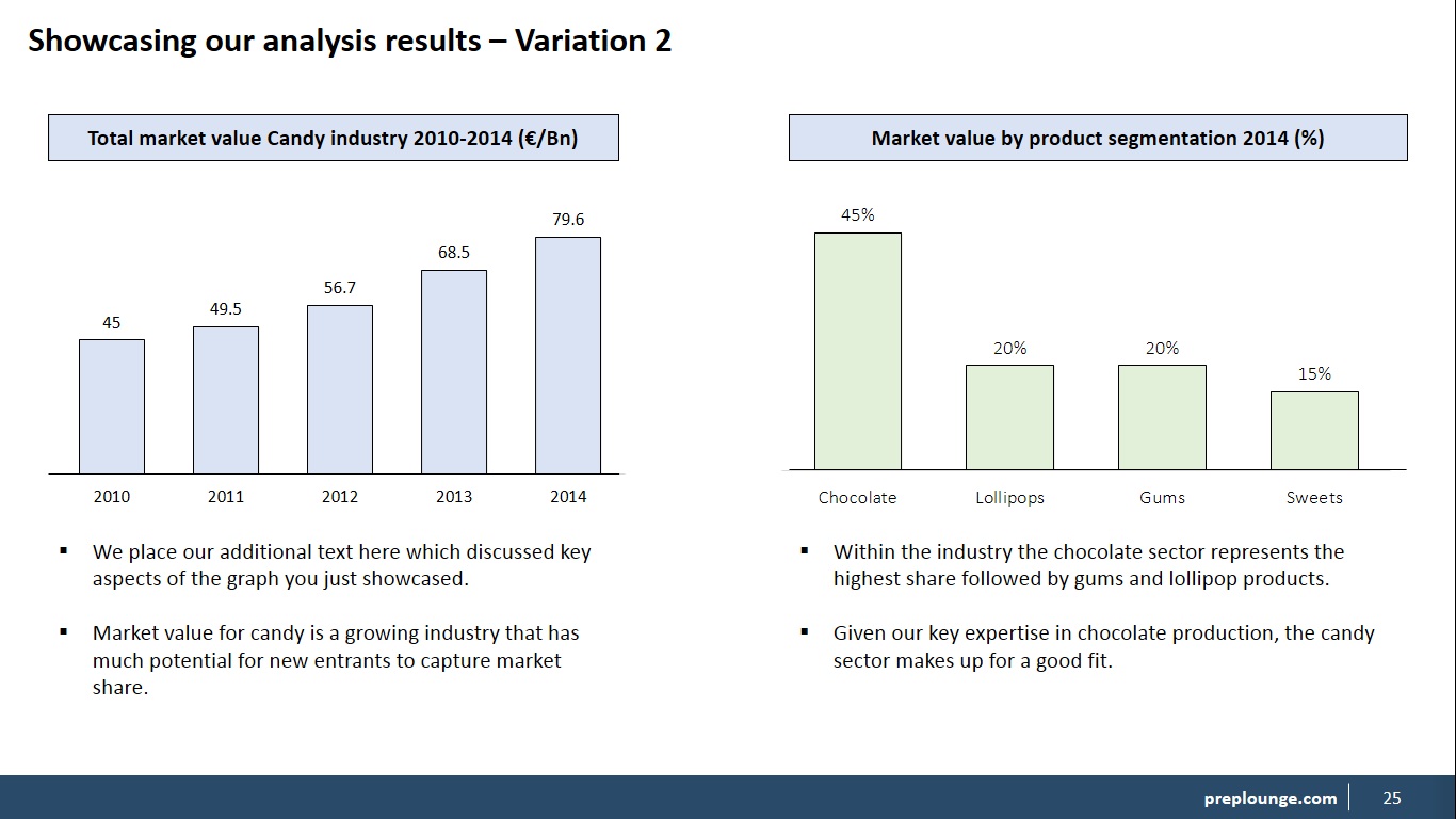
On our slide, we have two columns as in a left-side and a right-side column. You see how we placed the text below each graph and everything is also aligned with each other. Note how we gave the second graph a different color because it looks better for the audience so it doesn't confuse them. But make sure you have a clear contrast when using different colors. You can also choose to color the background fill of the text box but that is up to you. This gives us a clean a clear and professional slide. That's what we are aiming for.
Variation 3: Three-Column Slide
In the third variation, we will discuss a three-column slide which is a slide where we divide the slide into three components. This is used mainly when we have a lot of information to showcase that is correlated to each other. For example: The candy industry shows significant growth perspective with a focus on the chocolate sector but barrier to entry remains quite high.
If we take this sentence which is pretty much a conclusion we can break it down into three components and support each component with data in the form of a graph, table, shapes, text etc. Let's show you an example.
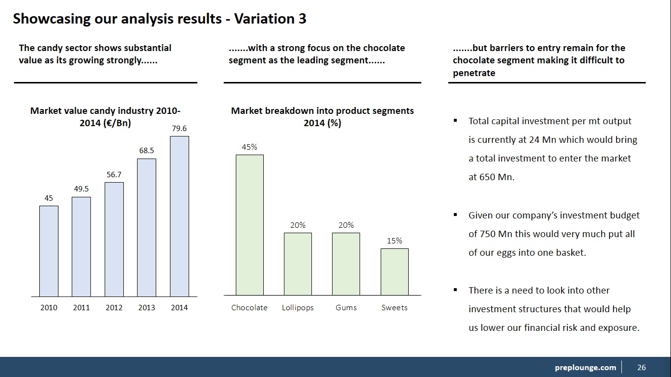
Looking at the slide, we can see three columns that each represent data-support for each component of our conclusion. So, we have two graphs and one text but you can pretty much define it in your own way as in how to fill in each column. Typically, it is a combination of text, shapes, tables and/or graphs.
Then above each physical component we have our part of the conclusion. We add the dots to indicate that the sentence is not completed and that it is continuing. This slide works well to put a lot of info on one single slide whilst making a strong three-tier conclusion. Now you can also try a four-column slide but that would be quite tight on the slide. Also note that we used text titles for the graphs instead of the rectangles.
Now let's take a look at the videos on how to design each variation.