Get Active in Our Amazing Community of Over 448,000 Peers!

Schedule mock interviews on the Meeting Board, join the latest community discussions in our Consulting Q&A and find like-minded Case Partners to connect and practice with!

Difficulty in understanding what accumulated profits mean in the context of this graph; case interview math

Bain Bain & Company BCG break-even break-even analysis Investment McKinsey McKinsey & Company quantitative analysis
Edited on Jul 25, 2022
2 Answers
888 Views
Akanksha asked on Jul 25, 2022

Hello guys, 

I‘ve recently begun my case preparation, and have been using craftingcases as a starting point. Right now, I am struggling with understanding the concept of “accumulated profits“ in the context of this graph given. 
 

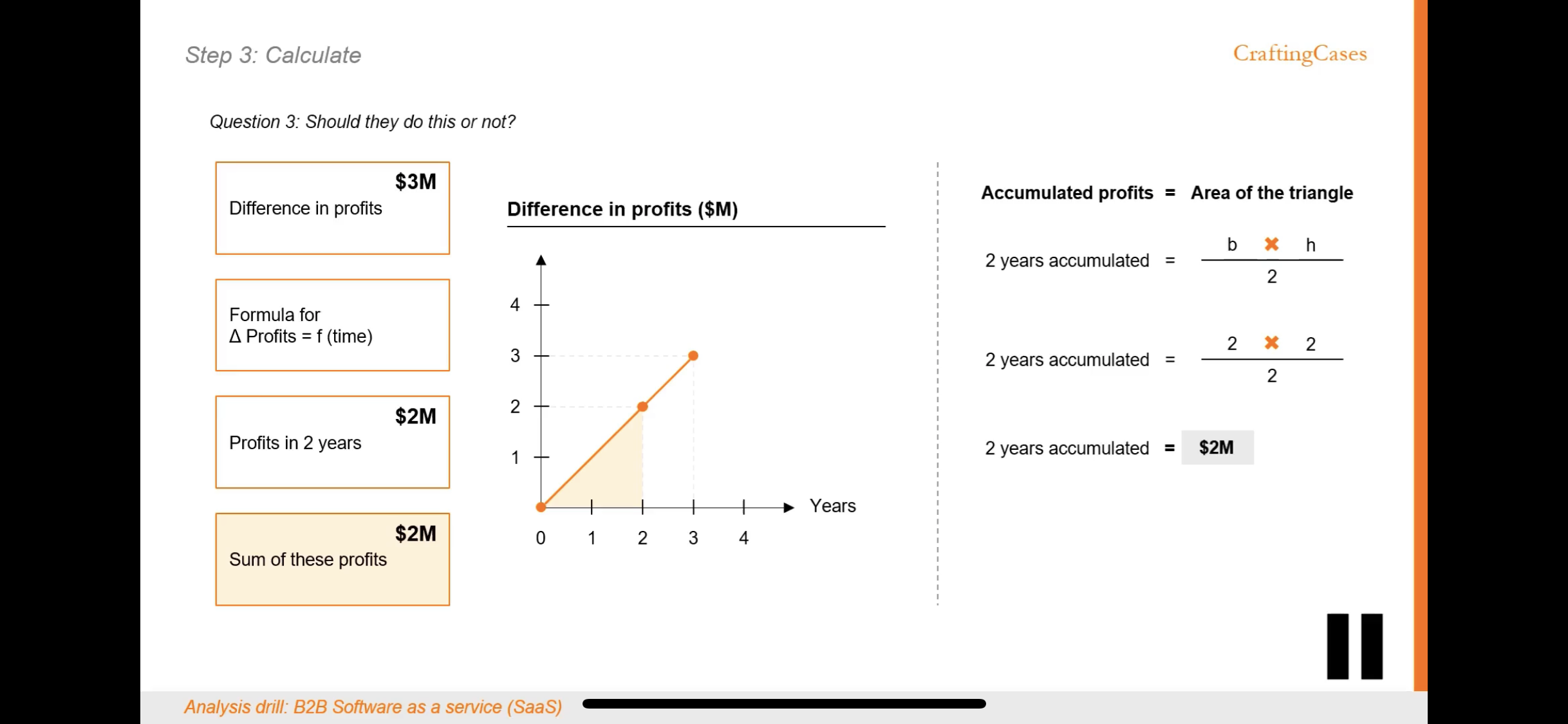
For context: The graph plots the increase in profits for successive years, so profits increase at an increasing rate for this company, and we need to know if the investment worth 2 M is worth it, considering the client wants his money back in 2 years max. 


What I understood: plotting the difference in profits for Y1 and Y2 based on difference we have calculated for Y3


What I did not understand: when we can already see that for Y2, increase in profits from year 1 is 2M, which is equal to the value of our investment; why are we calculating the area under the line graph? 
What is the significance? While I understand what this means conceptually, such as calculating the distance in speed-time graph or work done in Force-time graphs, I don’t know what accumulated profits actually mean in this context.

I am at loss of words, I‘ve been trying to understand this for over 8 hours now and I feel dumb. 

-1658725355-hckflyf55kjo.png
-1658725356-fbhym04elh4h.png

(edited)

Overview of answers

Upvotes
  • Upvotes
  • Date ascending
  • Date descending
Best answer
Moritz
Expert
Content Creator
replied on Jul 25, 2022
ex-McKinsey EM & Interviewer | 7/8 offer rate for 4+ sessions | 90min sessions with FREE exercises & videos

Hi there,

Here’s my take on your question:

What I did not understand: when we can already see that for Y2, increase in profits from year 1 is 2M, which is equal to the value of our investment; why are we calculating the area under the line graph? The increase from one point to the other is not 2M but rather 1M. However, we’re interested in the cumulative result and not points in time. To make it clearer, let’s not the area under the curve but bar charts instead with the height determined by the midpoint in each year (we can do this because the increase is linear - sorry for my awful drawing). In year 1 you have cumulative 0.5M and in year 2 you have cumulative 1.5M, which adds up to 2.0M cumulatively for those years.

Hope this helps a bit! Best of luck!

-1658734636-zvp81nx3vjwn.jpg
Was this answer helpful?
Akanksha on Jul 25, 2022

Thank you Moritz for your response. 
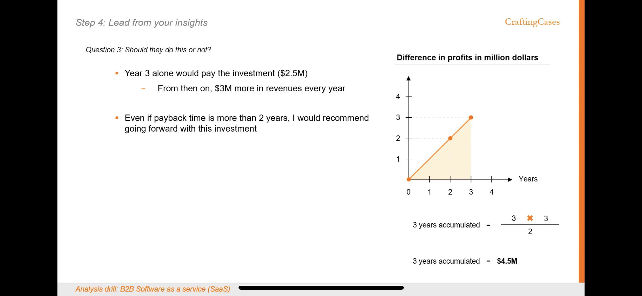
In this question, the client implements a new software to increase customers subscribing to their services, and it was profitable earlier too. Client would expect the increase in profits from when the software was not there, to determine worth of the investment. 
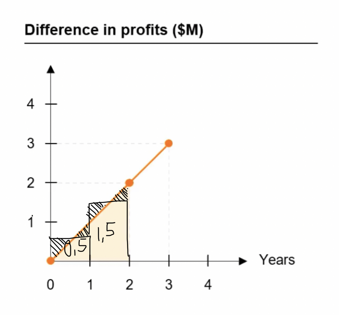
If I understand correctly, the value over accumulated profits (1-0.5, or 2-1.5) represents base level of profits (from the customers who subscribed to the client when software was not implemented) , and not growth, which gives us overall differences of 1, 2 and 3 M. Am I correct?

Moritz on Jul 25, 2022

The curve shows explicitly the difference in profits and should be understood as the incremental gain over the baseline enabled by deploying the capital. Not sure why you would read it as the baseline because then you wouldn’t have any info of the incremental gain. Hope this makes it clearer :)

Akanksha on Jul 25, 2022

I guess that makes sense.. although I still can’t understand. The graph does not plot the profits per year, but increase in the profits per year. Could you elaborate a simple example that helps me understand this? I believe there’s a severe gap or concept that I am entirely missing out on. Been tearing my hair over this 😰

Moritz on Jul 25, 2022

Difference refers to the increment over the baseline. The graph itself is absolute profits and the way to read it would be “annual average incremental profits at any given point in time”, which is increasing linearly on a daily basis e.g. 1M at beginning of year 2 and 2M at end of year 2. I simplified it by changing it to bar charts and showing this average as opposed the area under the curve concept, which results in 1.5M for the entire year 2.

(edited)

Akanksha on Jul 25, 2022

Okayy, I think I understand now. 2 M at (2,2) coordinate represents profit increase at the END of year 2, and does not tell us avg profit increase for the entire duration of year 2. Is that what you meant?

Pedro
Expert
updated an answer on Jul 25, 2022
30% off in March 2024 | Bain | EY-Parthenon | Roland Berger | Market Sizing | DARDEN MBA

This is complete nonsense.

Either the graph represents accumulated profit (and you only need to look at the values or year 2 and year 3 to know the accumulated profits at the end of that year) or it represents yearly profit and you would need to add the profit at the end of each year to estimate accumulated profit, but in that case you DO NOT calculate areas, but simply add the values at year end. The reason for this is that the yearly profit is a discrete variable, not a continuous one (you would only need to calculate areas if this was a continuous variable).

I might be completely wrong and may be not understanding this problem at all - in any case, this seems to have to relationship at all with how one would do things in real life, which ultimately leads to my initial evaluation: this seems to be complete nonsense. Move on and don't waste your time.

(edited)

Was this answer helpful?
How likely are you to recommend us to a friend or fellow student?
0
1
2
3
4
5
6
7
8
9
10
0 = Not likely
10 = Very likely