Why does S.Korea, and Brazil slope downwards even though they are increasing in %? Can someone explain how to read this graph?

Why does S.Korea, and Brazil slope downwards even though they are increasing in %? Can someone explain how to read this graph?

Hi there,
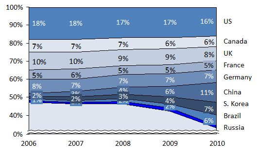
Basically the graph shows the % distribution of the countries. Try to not read the lines in the graph, but rather the volume. So that means that if in 100 ‘units’, Russia went from ~47 in 2006 to ~15 in 2010, that ‘space’ in the market is filled now by other countries such as S Korea, Brazil and China. Hope this makes sense. Best of luck!

They are not the ones “going down”. Russia is becoming smaller (having lower % weight) and because those two stand immediately above Russia they also “seem” to be going down.
What this graph says is that China, S.Korea and Brazil are replacing Russia as a supplier/producer/consumer.
If you reversed the countries order you would clearly see those three going up, with Russia becoming smaller.

Hi there,
The chart is showing numbers out of a total 100%!
So, because Russia is losing so much %, Brazil and S Korea have to “fill” that spot.
If you read their percents, they are increasing, but they are next to a country that is decreasing. It's just how this chart works!

Hi!
Other coaches already gave interesting insights!
Not much to add here.
Best,
Anto

Because Russia's share is declining.
This is a percentage stacked area chart.
Percent Stacked Area Chart consists of several area series consecutively stacked on top of one another. Values along the Y axis range between 0 and 100%.
The height of each series in a Percent Stacked Area Chart is determined by its contribution to the sum of all values in a certain category (on the X axis).
Percent Stacked Area Charts are a great way to follow the variation of each of several variables simultaneously as well as their percentage ratio over time.