

Consulting Consulting
Back to overview

Mckinsey Chart interpretation

Dear community,


I have a question regarding the chart interpretation task at Mckinsey. What exactly do do the interviewers expect? Should we state all kind of insights we can gather from a graph? Only think about the most important ones? Should we take time to analyse the graph and come back with insights or talk right away? What are your tips to stay structured?

Any tipps are highly appreciated.


Thank you!

14
6
300+
Be the first to answer!
Nobody has responded to this question yet.
Top answer
Profile picture of Marisa
Marisa
Coach
on Jun 30, 2026
Ex-McKinsey | Offers from Bain and BCG | Booth MBA and Consulting Co-Chair | Engineer

I agree with Enrico that there is no "right" way to read the charts. 

However, in my personal experience and as a coach, I recommend: 
1. Take a beat (3 seconds max) to understand the over-arching point of the chart

2. Walk through the structure of the chart

3. Draw big insights that relate to the original question from the case. Do not read everything from the chart. Everything you say should relate back to the main question. 

--------------------------------------------------------------

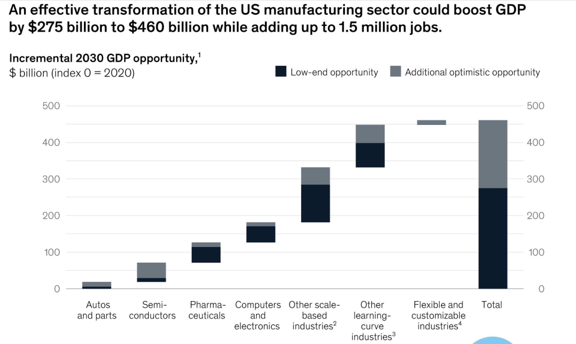
For example, if I'm working on a case that asks "What industries and specific sub-sectors should the US government prioritize to boost GDP", and I'm given this chart, it might sound like:

1. *Slight pause*

2.  "Okay, so this chart shows the potential GDP opportunity size for the manufacturing industry broken down by sub-sector which could total up to $460B, optimisitically"

3. "Looking at this breakdown, other scale-based industries could contribute up to ~$150B GDP alone, and about ~$100B of this considered low-end opportunity (conservative estimation), so I would recommend this as primary path.  Secondarily, we should consider other learning-curve industries, as this could account for up to an additional ~$110B.  Depending on how many we are able to prioritize, we should also rule out Flexible and customizable indstries and semi-con, because both are small and rely heavily on optimistic opportunities only.  Next, I'd like to dive into what it would take for our client to make the transformation of our two primary focus areas a reality."

Profile picture of Enrico
Enrico
Coach
on Jun 30, 2026
Ex-McKinsey EM & Interviewer | Calvanese Advisory | Calibration Diagnostic | 100+ McK interviews

A few thoughts from having interviewed candidates at McKinsey on this exact task.

On timing, you can simply ask the interviewer whether they would like you to read the chart aloud as you go, or take a moment to study it first. Both are accepted, and they call for different behavior.

If you read it immediately, use that running commentary to orient yourself, and ask the interviewer to clarify anything ambiguous about how the data should be read. The dialogue itself becomes part of how you understand the exhibit.

If you take time first, twenty to forty seconds of quiet study is fine, but do not then narrate every data point when you come back. The interviewer assumes you already did the reading in your head, so go straight to your insights.

The most important point, and the one I would really emphasize: what separates a strong answer is not stating what is high and what is low. It is drawing inferences and forming hypotheses. The single most useful habit here is to identify the inputs and the outputs in the chart. Ask what factors determine a given outcome, and how that outcome varies across time, location, segment, or whatever dimension the chart plots. Labeling each element as an input or an output gives you a simple mental model for generating insight rather than description, and it forces you toward the question that actually matters: what does this mean for the client.

A few things follow from that. There is no credit for volume of observations, so lead with the one or two insights that move the case forward, state them top-down (headline first, then support), and tie them back to the client question or your hypothesis. Being able to say "there are several things I could comment on, but the one that matters is this" is exactly the judgment being tested.

Happy to expand on any of these.

Profile picture of Federico
on Jun 30, 2026
Ex-BCG Partner, Interviewer & Career Advisor | Fully tailored approach

Hi! In my experience, interviewers assessing a candidate on a chart look for two things: at a basic level, a correct read of the data; at an advanced level, a sophisticated interpretation in light of the broader case.

What does it mean in practice:

  1. Take a few seconds to read the chart before speaking. A short pause is expected and reads as composure, not hesitation.
  2. Start descriptive, then go implicative. Say at a high level what you see first. The descriptive part allows you to make sure you are getting the big picture right before moving into the detail, and it builds a common understanding with the interviewer. Then move to what it means.
  3. Push for second-order implications, not the obvious read. Anyone can state the first-level fact. The differentiation is the inference behind it and the link with the broader case and client issues you are tackling. For example, if your sales are growing faster than the market, the best cadidates say "we are gaining share".

Hope it helps and good luck with the prep!

Profile picture of Ashwin
Ashwin
Coach
on Jul 02, 2026
Ex-Bain | Help 500+ aspirants secure MBB offers

Chart interpretation is where a lot of strong candidates get sloppy. Here's what McKinsey wants.

Not every insight. Quality over quantity. Dumping ten observations makes you sound unfiltered. They want the two or three that actually matter for the case, and they want you to say why they matter.

Yes, take a moment. Don't talk right away. A short pause, 20-30 seconds, to read the chart properly is expected and looks confident. Rushing leads to shallow reads.

How to stay structured:

  1. Start with the takeaway. Read the title, axes, and units first, then say what the chart is showing in one line before diving in.
  2. Give the "so what," not just the "what." Not "sales rose in Q3" but "sales rose in Q3, which suggests the promotion worked and could be worth repeating."
  3. Tie it back to the case. Always connect the insight to the problem you're solving. That's what separates a good candidate from a data reader.

Quick flow: pause, state what the chart shows, pull the 2-3 key insights, explain the so-what, link to the case.

Profile picture of Hagen
Hagen
Coach
edited on Jul 05, 2026
Globally top-ranked MBB coach | >95% success rate | 9+ years consulting, interviewing and coaching experience

Hi there,

I would be happy to share my thoughts on your questions:

  • First of all, contrary to what other coaches have said, there clearly is a right way to analyze a chart wholefully: 1) Take some time to digest the new information your received, 2) ask clarifying questions if necessary, 3) describe the chart in one sentence (in order to avoid "reading" the entire chart to the interviewer), 4) share the insights in a top-down way, and 5) communicate the derived implications from the insights.
  • Moreover, they neither want "all kind of insights we can gather" nor only "the most important ones", but all relevant insights - and the number depends of course on the exhibit at hand.

If you would like a more detailed discussion on how to best prepare for your upcoming McKinsey pre-interview assessment and/or interviews, please don't hesitate to contact me directly.

Best,

Hagen

Profile picture of Alessa
Alessa
Coach
on Jul 10, 2026
10% off 1st session in August | Ex-McKinsey | Ex-BCG | Ex-Roland Berger

hey! 

the expectation is very simple: give the one or two most important insights clearly and in order. Do not list everything you see. Do not talk immediately. Take a few seconds to read the title, axes and legend, then speak in a clean top‑down way. Start with the main message of the chart, then add one supporting point, then stop. This keeps you structured and prevents you from drowning in details. If you want, I can walk you through a short chart flow you can use every time.

Best, Alessa